
Congratulations to AIA Columbus’ 2017 Architecture Award Winners
AIA Columbus received 65 submissions this year. Thank you to all our sponsors and members for making the ceremony a memorable event!
View photos from the evening here
Honor Award
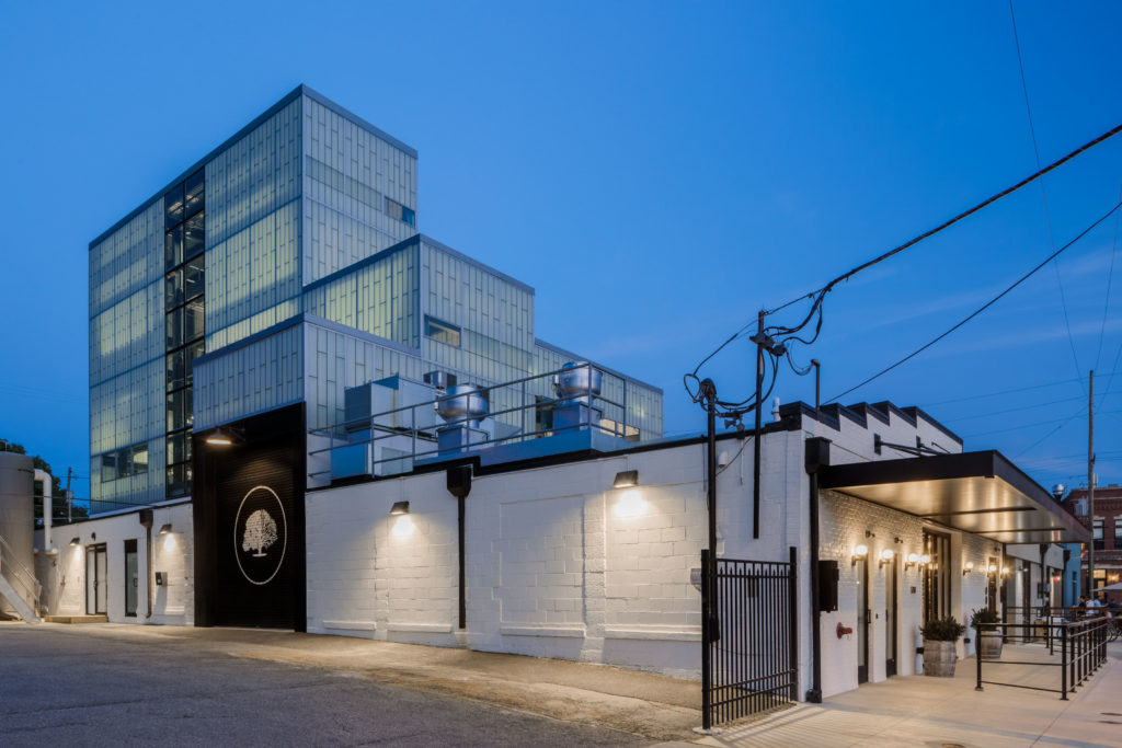
JBAD | Middle West Spirits
Project information:
Middle West Spirits operated their artisan small batch distillery business from a 9,000 square foot, 1920’s era historic warehouse structure in a quickly gentrifying urban neighborhood of Columbus for several years before deciding to expand. Their plans to increase their capacity required new distillery equipment, including stills of 15 to 50 feet in height and several large fermenting tanks, as well as a public tasting room, bottle shop and offices. To accommodate this equipment, a center portion of the original steel bow truss and wood roof was removed and a new 55 foot tall, tiered steel structure was inserted over new foundations below. The new structure was clad entirely in Kalwall panels, creating a monolithic white tower with a both striking and subtle daytime presence and a glowing, beacon-like quality at night.
The tasting room and adjacent bottle shop feature exposed ceiling structure with a new skylight over an antique bar and seating. A large set of collapsible window panels open to a street-side patio. In this way, the re-imagined distillery directly participates in and amplifies the lively retail and entertainment neighborhood. Behind the public spaces, the production area features a private vestibule and a series of industrial, steel-structured mezzanine levels climbing to the uppermost sections of the stills to provide access for operations and maintenance and for public tours. The second level includes a public education space with a projecting frameless glass window to capture views of the neighborhood.
The singular, monolithic nature of the addition and its disconnected relationship with the ground plane create an ambiguity of scale. Its contrasting relationship with the historic warehouse clearly illustrate its role as a “parabuilding” – that is, an addition or alteration (“parasite”) to an existing building (“host”) that transforms the essential character of the original structure.
Judge’s comments:
This an absolutely beautiful project. The whole form operates as a celebration of what they are doing with the production of their product. The use of materials was really elevated – the patterned use of the kalwall really changes the entire perception of the material. The jury loved the industrial touches and the reuse of the historic warehouse. The hovering abstract form beyond the mass of the warehouse is compelling. They really did a wonderful job – top to bottom down to the tile details and the color palette. We found this project to be unexpected and such a high quality – it’s a great example of pushing the mundane to a higher level.
Honor Award – Built
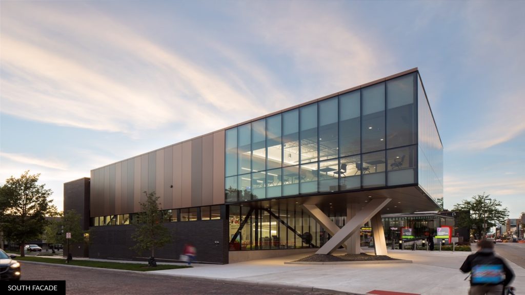
NBBJ | Columbus Metropolitan Library Northside Branch
Project information:
The Northside library currently sits at a junction of four significant urban vectors in Columbus; the Short North growing north, the University growing south, the Peach District bordering to the west, and Weinland Park to the east. Rather than one single contextual driver, the library is a reflection of this unique junction, and as such celebrates the scale, material and vibrancy of these neighborhoods.
Taking advantage of the exposure along high street, the footprint and primary massing of the building is pushed to the east side of the site, while parking is situated at the west to allow vehicular access from McMillen and service access from the alley. The program synergizes different services, assets and uses emblematic of the modern institution of the library. In service of that idea, the building proposes a common “civic living room” around which those activities can occur, allowing physical or visual access from all major components of the building. As this space is imperative to the building function and symbolic of the library’s nature, it is important to make it seen from the interior and exterior. Massing is redistributed from the east side of the site to expose the living room to the street and create an elevated, cantilevered space at the southeast corner. In addition to this added visibility, this also creates a pedestrian plaza that addresses high street and building entry. The newly cantilevered volume houses a flexible “reading loft”, allowing customers an elevated view of the city as well as a flexible space that can shift between library specific function and event space.
Judge’s Comments:
We did quite a few library projects this year. This branch really stood out. This project is certainly One of the best detailed projects we saw across all project types. It’s sophisticated – its spatially rich. The resolution of the structure and the attention to how everything meets the ground is exceptional. The metal siding is beautiful and subtle – Even the rear façade was well considered. The entries and lobbies are all well executed interior spaces. This project shines as being restrained without being pretentious.
Merit Award – Unbuilt
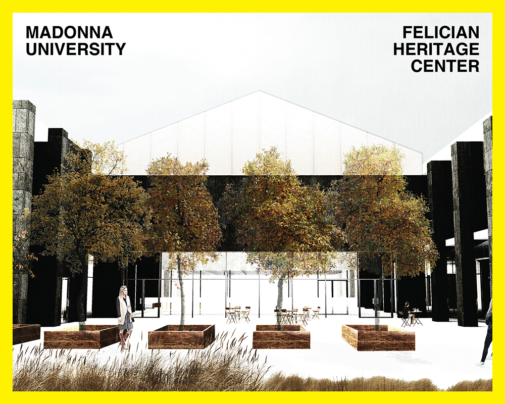
MKC Architects | Madonna University Felician Heritage and Welcome Center
Project information:
The Madonna University Felician Heritage Center is a marriage between two entities to create the narrative for both an expanding university and the history of the Felician Order. The University desired a contemporary welcome center – the first visit for all incoming students – while the nuns were looking for something steeped in history and a site where their order could take a pilgrims journey. Based on historical research, this modern interpretation of St. Francis of Assisi Cathedral weds archival facilities, changing exhibit spaces, administrative offices, and places of leisure – all organized around a central cloister design. With a broad program, and a tight budget the Felician Heritage Center manages all elements with both a youthful imagination and a pragmatic form.
The Felician Heritage Center will be a state-of-the-art welcome center and musuem on the Livonia Michigan Campus of Madonna University. One of the unique features of the Welcome Center is the convergence of seemingly different programs into a single building. As such, the program has been organized into two different spatial configurations based on their specific function:
UNIVERSITY PROGRAM: More formal and efficient university spaces including an art gallery and bookstore, as well as administration offices on the second floor. The University wings will feature a multiple use shared event space known as the Great Room.
FELICIAN HERITAGE CENTER: At the center of the building, the Felician Heritage Center will utilize darkness and light to create a memorable interactive experience. The Felician Sisters’ Museum is on axis with the secondary entrance and cloisters. This center of the building is accessible through an open Procession Hall, celebrating the history of the Felician Order.
The Heritage Center is due to begin construction in early 2018 and be completed summer 2019.
Judge’s comments:
The jury really liked the exterior design concept and the presentation made it clear that the project had been thoroughly considered. The rigor of the graphic representation of the architecture was letting them down. We were intrigued by the center atrium space and how the installation would appear from beneath and as you move along with balcony edge, looking down – but the graphic nature of that space, had us reaching to find the true experience. We feel that awarding this project an unbuilt award could support the architecture and play a role in insuring that it gets built.
Merit Award – Built
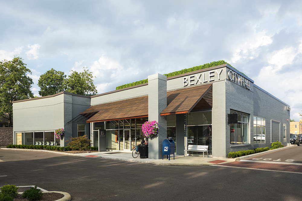
GRA+D Architects | Bexley City Hall
Project information:
The City of Bexley is charming, historic, and landlocked. Faced with no opportunities to grow out – the city is forced to look for ways to maximize every opportunity to redevelop. The old City Hall building had two things working against it. One, it sat on prime Main Street real estate. And two, built in the 1950’s it was aggressively ADA inaccessible.
Those issues in mind the City made the enlightened decision to relocate their offices and redevelop the site of the previous city hall (now a two story grocery store). The new city hall is located at the rear of a strip center adjacent to the previous building. Just off Main Street, the space was marginal, at best, for retail. But for this civic function the space has proved to be ideal.
Project goals included creating a separate identity for the building while still acknowledging its context. It was also a stated goal to develop the design from the perspective of the building’s visitors whether for a civic function, or arriving to pay a water bill (or parking ticket). User friendly was the mantra.
The project emphasized openness and flexibility – ultimately cutting in half the total number of square feet required to accommodate the functional needs. The workings of government are visible through the windows of the building – with prominent views provided in to council chambers as well as the large conference room. Careful zoning of the building allows it to function during off hours as a venue for various community meetings.
Vestiges of the old facility appear throughout the new building. Marble partitions are redeployed as horizontal counters. Original stone is reused as wall cladding in the council chambers and the front desk. The CITY OF BEXLEY signage from the exterior of the original building is reused in council chambers. Wood from a mix of dead city trees is used throughout the building as wall cladding – complete with labels to identify the species.
Judge’s comments:
This project really excited the jury. They were clearly doing a lot with a little – the design approach was clean and subtle. We felt that it compelled a hopefulness. Everywhere you turn there were good decisions – color palettes, efficient and design focused signage and the council chambers were very nice. Integrates well into strip mall fabric and elevates what that experience is. One jury stated “what this says about government is a good thing” which is this current atmosphere is a very positive expression.
Merit Award – Built
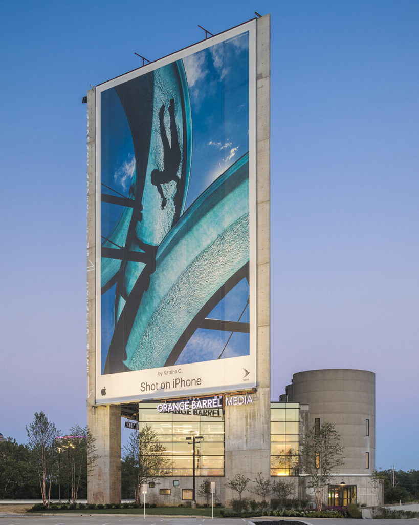
Acock Associates Architects | Orange Barrel Media Headquarters
Project information:
Orange Barrel Media’s new headquarters needed to fulfill two fundamental goals. It needed to be an excellent example of sustainable design and needed to express what their product is.
The site selection was critical to achieve these goals. The site is located in Franklinton, one of Columbus’s oldest neighborhoods dating back to the 1700’s, and a somewhat forgotten urban
area.
The OBM project is located at the neighborhood’s north limits, on a brownfield site, an abandoned concrete mixing plant. Decades ago, Arrow Concrete constructed a mixing plant (including concrete silos for storage of cement, sand, and aggregates) that produced the concrete for the construction of the adjacent State Route 315. Since that time, the contaminated site has been a visual blight, one that was seen by thousands every day as commuters would pass by on State Route 315 and Interstate 670.
The project abated the site, with the design purposely and functionally incorporating the three silos into the building footprint. The new construction continued to utilize concrete as a key design element of the project. Concrete building frame, expressing the columns and slabs, and concrete wallscape mural art support pylons creating a dynamic composition. The dramatic triangular shape
of the formed concrete pylons are a result of carefully studied options.
Orange Barrel creates wallscape mural advertising. Creative building art applied to urban structures around Columbus. This project was to provide an example of their work, integrated into the building design. The glass curtainwall office structure with its reclaimed wood finishes and furnishing is designed as an outgrowth of the existing concrete silos. Towering 160 ft above grade are the three pylons, these providing the framework for two 75 ft x 120 foot wallscapes + a south facing solar panel array. The studied options for pylon locations created optimal viewing orientation for the wallscape and true south orientation for the solar panels, panels that provide the majority of power needs for their business.
The design solution integrates revitalization of a site, thoughtful material selections, promotion of the client’s product, and established a new Columbus landmark. Rather than seeing residual industrial blight, thousands of commuters now see an ever changing art display.
Judge’s comments:
We were enamored with this project – it was a novel problem and the solution embraces that nature. This project elevates the curious structure and spins it to a creative hive. We all loved the reuse of the silos and really enjoyed the spaces that those forms result in. The pallet was scruffy and cool – the concrete finish and the general rawness was exciting. We also really appreciate the integration of the billboard and a kind of intersection use and statement piece. This project is very striking.
Merit Award – Built
Moody Nolan | Columbus Metropolitan Library Shepard Branch
Project information:
The Shepard Branch, while being the smallest Library in the CML’s system, is demonstrating it may be having the largest impact on the Shepard Community, a reemerging historical neighborhood once coined “the gateway to Columbus”. Dr. William Shepard was responsible for founding this community built around his “water cure” hydro-therapy spa/treatment facility and the Alum Creek Ice Co. both benefiting from their location along Alum Creek. The community has been in desperate need of a “gateway” itself having its identifiable entrance and connection to
Alum Creek taken away by the construction of I-670 freeway.
The site is located along the community’s east edge at it’s most prominent “entrance” off I-670. The site is also sandwiched between two of series of City Parks connected by the State bike trail along the Alum Creek Corridor. The Library simultaneously becomes the perfect “Community Gateway” and “City Park Connection”.
The building is expressed as one large room with large community “porches” allowing visual and physical entry and transparency. The simple box is subtly twisted apart referencing the placemaking ability flowing water might generate while giving a nod to the importance of Alum Creek’s role in the formation of the Shepard Community. The quietly twisting form is clad in bronze stainless steel shingles whose reflections play with the environment much like those of moving water. The shingles are coined “dragon scales” by the neighborhood’s children…the hope is the shingles and the space within continue to foster imagination and inspiration while providing a unique gateway entry experience to the Shepard Community.
Judge’s comments:
The jury felt this project did a great job of expressing the very clear concept of the twist or the fold and used the materials well to demonstrate that concept. We really appreciated the clarity of the idea and the restraint expressed in the simple moves. The roof form is such a strong element and we applauded the effort of using the roof to inform the interior – that was very successful. We also really appreciated how well the mechanical was integrated. This is one of the strongest conceptually clear projects we reviewed.
Merit Award – Built
Tim Lai ArchitecT | Trism
Project information:
TRISM occupies 6,000 square foot in the South Gateway Development, right on the south border of the Ohio State University’s main campus. The new business is a juice bar by day and bar and event space by night. The design, therefore, is intended to be flexible and adaptable to provide a transformative experience to customers. Breaking boundaries and being versatile are key concepts driving the business: when nutritious smoothies in all time of the day are replacing set meals likebreakfasts, lunches and dinners; when studying, dining, socializing and entertainment happen all at once. The space is divided into three areas: the juice bar/ courtyard, the liquor bar / flex space and the stage. The three full height garage doors lining TRISM’s frontage on the busy High Street (a major corridor for The Ohio State University and in Columbus) open to the patio, allowing seamless flow between indoors and outdoors.
The juice bar area provides various seating arrangements that resemble that of an outdoor courtyard. These modular seating blocks are made of a combination of wood and bricks. They are constructed with various heights to accommodate diverse seating positions and postures.
The seating arrangement is informed by the observation from college students’ sitting postures when studying, using their electronic devices and interacting with their peers. Stackable lounge chairs and round coffee tables are meant to be moved around freely.
Fusing the inside and outside is the theme that runs through the project. The two patios, one on High Street and the other on Chittenden Street, are meant to connect street life to happenings inside the space. The patio newly added on the Chittenden Street activates the otherwise vehicular-centric corridor. The activities at the patio add human interest and help slow down traffic for pedestrians, increasing walkability of the neighborhood.
Judge’s comments:
We found this project to be exceptionally successful across the whole interior – from the larger concept, down to the small details. The architectural intervention as furniture was compelling and thoughtful. The material quality was very nice, the natural textures – the pastel color treatments of the artwork with the black ceiling is a very nice contrast. We all loved the table on stairs – -that was really great. Overall, we felt that the space was very well detailed – and loved the plywood – using inexpensive materials to pull off a space that feels very sophisticated.
Student Award
Erin Pesa, Philip Sour and Sadie Webb | Block Parti
Project information:
The primary goal of the scheme was to respond to the existing context surrounding the Franklinton site; we sought to achieve this through both scale and maintenance of pedestrian thoroughfares. In the portion of the site surrounded by Franklinton, we responded to the height of the community by populating the site with 4-story, 4-unit blocks. In the portion surrounded by the park; however, height was unlimited. We took advantage of the views of the river and downtown and essentially created a vertical equivalent to the rest of the site by stacking the 4-story blocks into a tower. The organization of the blocks allows for pedestrian traffic to continue across the site by creating three courts: an entry plaza off the street acting as a front door to the blocks, a back-of-house alley to access underground parking, and a backyard space to provide an abundance of outdoor green space for residents.
Judge’s comments:
Of the student work submitted – we were very impress with the level of level and the level of resolution of the idea in this project. The project takes the urban housing condition seriously and vets the idea across multiple configuration. The project works to design an experience and community and takes it well beyond a simple level of intrigue or graphic test, which we felt was the case with some of the other student projects we reviewed. All in all, we could see this project having real substance as a built project.
Pictures